Evolving a cybersecurity brand for enterprise growth
OverviewWhen Intruder needed to move upmarket from SMBs to enterprise customers, our playful retro brand, while beloved by smaller customers, risked appearing unserious to Fortune 500 CISOs.
I led our design team through a strategic brand evolution that maintained our distinctive personality while adding the polish and maturity needed to compete against vendors with 10x our resources.
GoalsMature brand to appeal to revised target audience of enterprise scale customers.
Develop but retain Intruder’s distinctive brand identity.
Apply the revised identity across all brand touch points.
RoleLead designer and project leadQ4 2024WhenProduct Design, Engineering, Marketing, Senior LeadershipCollaboratorsContext and Team
Intruder had built a strong position in SMB vulnerability management with a distinctive retro gaming aesthetic that set it apart. But to achieve growth targets, they needed to win enterprise deals against established competitors like Tenable, Qualys, Crowdstrike and Rapid7.
The core tension: How does Intruder mature the brand enough to win enterprise trust without losing the personality that differentiated it in the first place?
Specific concerns from leadership:
Would Intruder be taken seriously at industry conferences next to major competitors?
Could Intruders’ visual identity hold up in lengthy enterprise sales cycles?
How does Intruder signal "enterprise-ready" without looking generic?
I was able to pull the full design team to focus on this, as well as having support from both Marketing and Engineering. My primary stakeholder for the project was the founder and CEO of Intruder.
The Problem
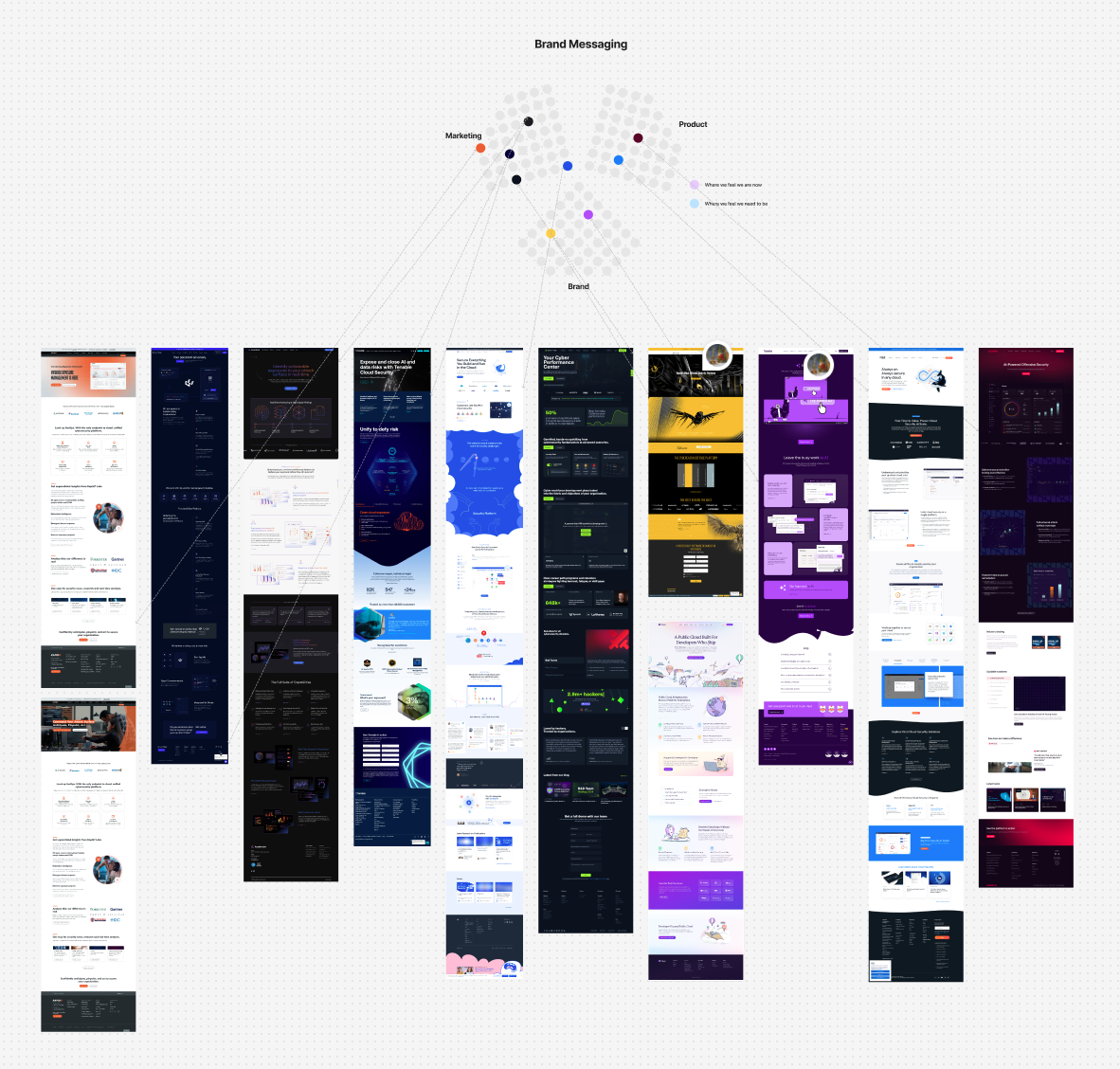
A lot of brand surfaces, like the marketing site, were dated and hadn’t kept up with the brands development. Before going any further we began by taking an inventory of brand assets so that they could be approached holistically.


Research and Insight
Discovery & Validation
Rather than accepting the assumption that the brand was the blocker, I started by validating the problem:
Sales team interviews: Gathered feedback on deal objections and competitive positioning
Customer research: Spoke with existing enterprise customers and recent lost deals about perception.
Competitive audit: Analysed how competitors presented themselves at conferences and in enterprise sales materials
Internal brand audit: Mapped every touchpoint where the brand appeared - product, marketing site, sales decks, conference presence, support docs
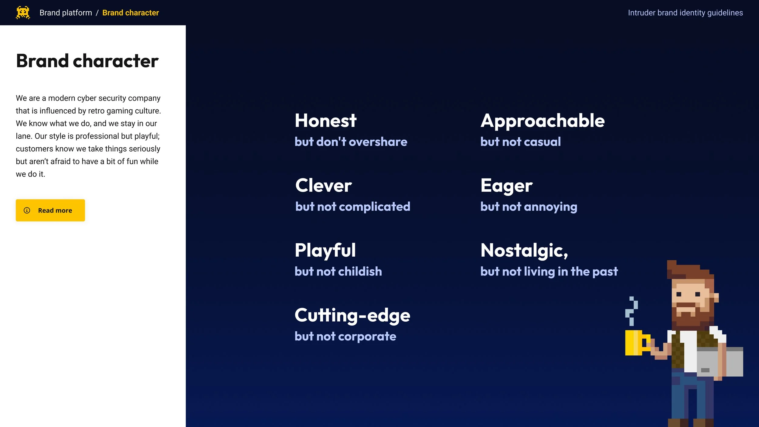
Key insights: The feedback I got from Sales was that whilst the Product needed to scale to accommodate the size of the attack surface we were seeing with Enterprise customers, the brand’s retro aesthetic was curbing expectations of what the product itself was capable of. At the same time, they universally loved the brand’s character.
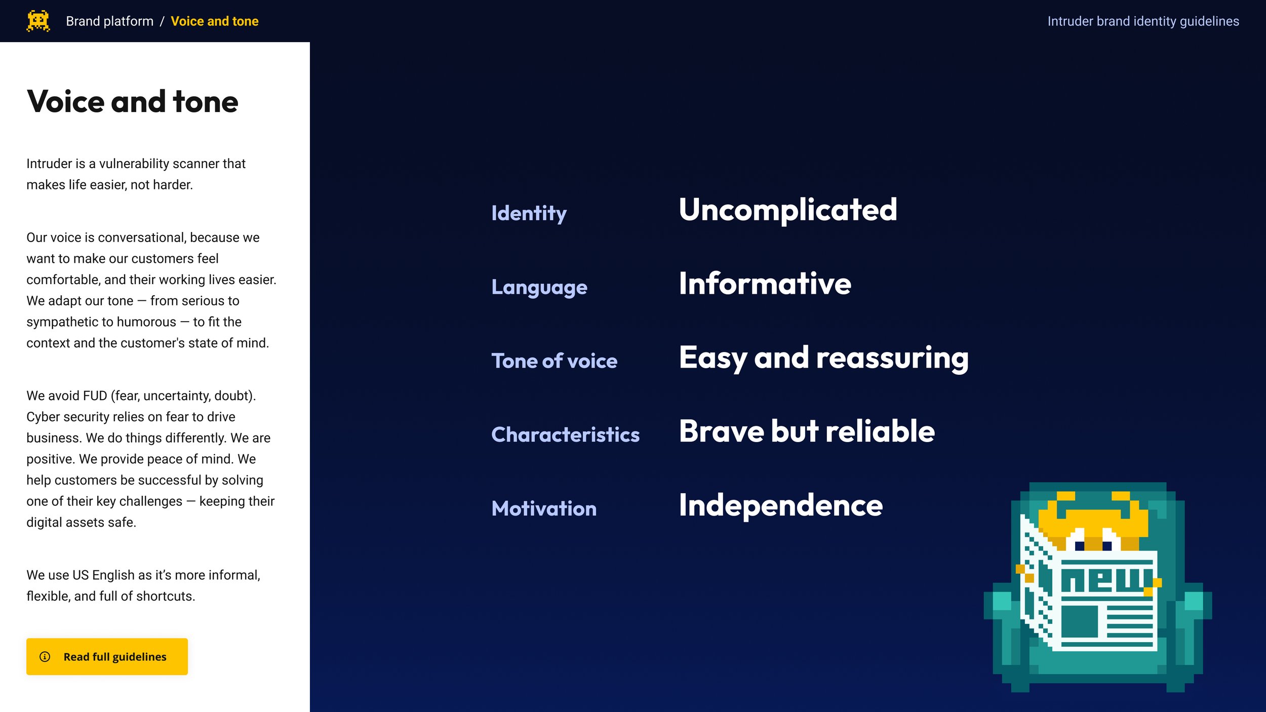
People who worked in cybersecurity were also, unsurprisingly, risk-averse, and we knew that our customers valued Intruder for the ‘Peace of Mind’ it offered them. This was the same for the enterprise-scale customers we already had; but the brand didn’t communicate this to them. The stakes were higher, and they couldn’t take a risk on something that didn’t pattern-match what they were looking for. Intruder appeared immature.
Even the company's name caused confusion at times. Intruders, or hackers, were called ‘threat-actors’ in the industry. The term wasn’t typically associated with stopping vulnerabilities. This led me to the conclusion that Intruder needed to predominantly communicate two things:
Intruder needed to mirror customers’ expectations of an enterprise-scale solution without sacrificing personality.
Intruder can offer Peace-Of-Mind at scale and must mature from ‘playful’ to ‘quietly confident’.
In a review of our competitors, we also noticed that many of our enterprise-scale competitors placed a much greater emphasis on marketing than we had historically. Intruder had tended to be very product-led, whereas our competitors focused much more on messaging. If we want to mirror them, we’d perhaps want to explore that shift too.
Strategic Framing
After the initial research and review I worked with leadership to establish some core brand principles to guide decisions. This really helped us thread the needle for who we wanted to be in a way which would keep us distinct from competitors:
We then began to work on various concepts in light of the above, coming up with a range of directions that we could have explored. These were iterated on repeatedly in light of feedback from senior leadership, customer facing teams, and a sample of customers within our ideal customer profile.
Solution and Execution
Visual Evolution
What I kept:
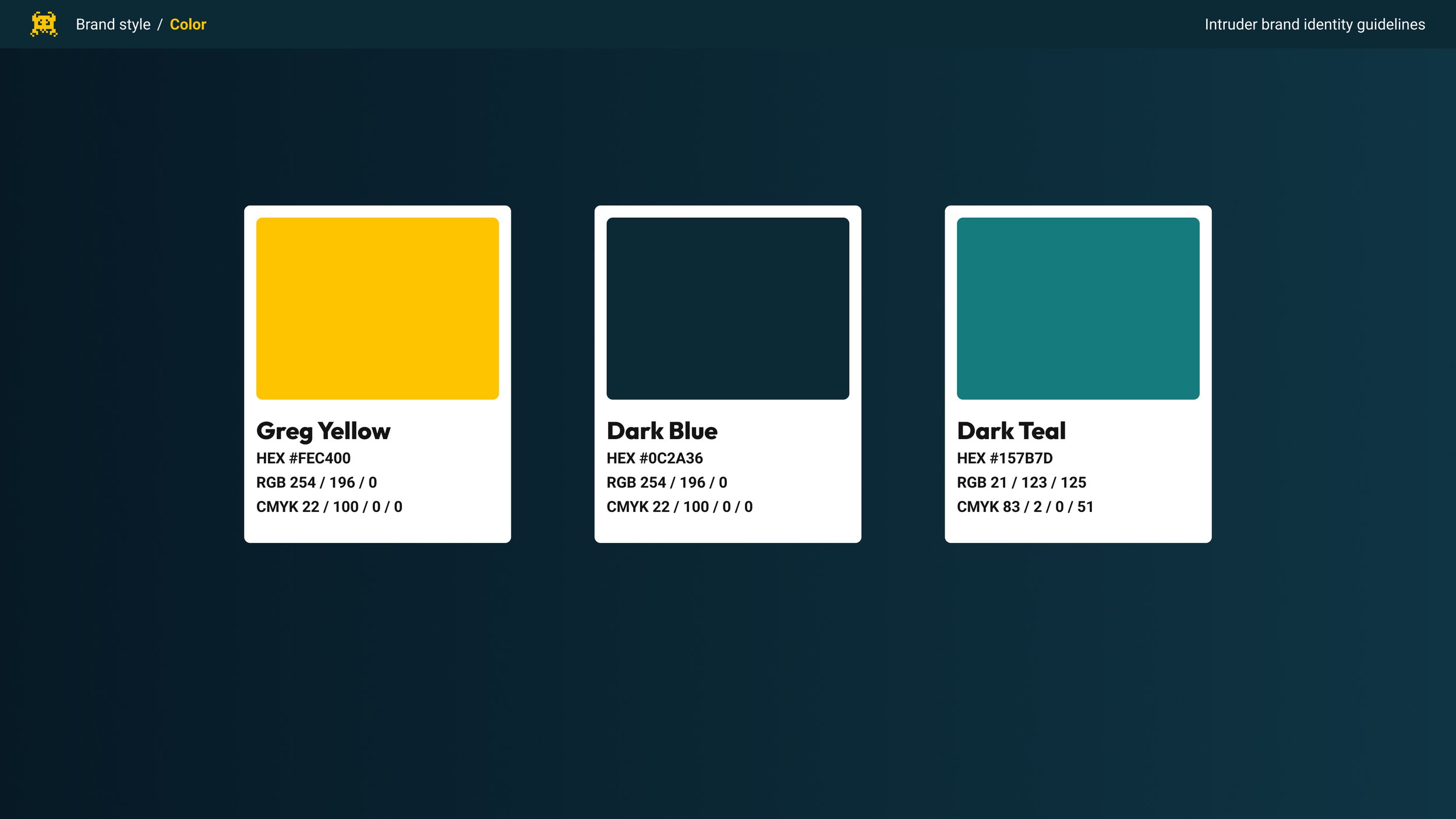
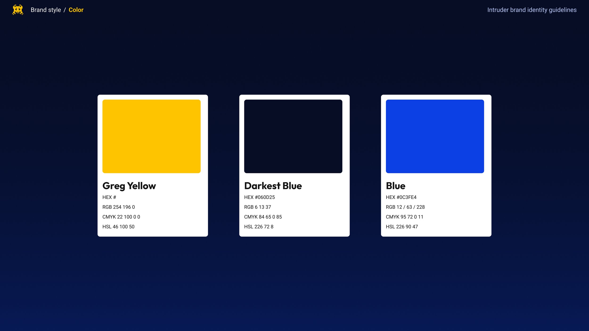
Everyone loved Intruders logo, externally and internally, and the merchandise we produced featuring it was always extremely popular. As a result, I kept it’s Yellow as our accent colour.
Whilst I explored changing it, given time constraints and the range of debate around it, I made the decision not to fundamentally change Typography as part of this.
What I evolved:
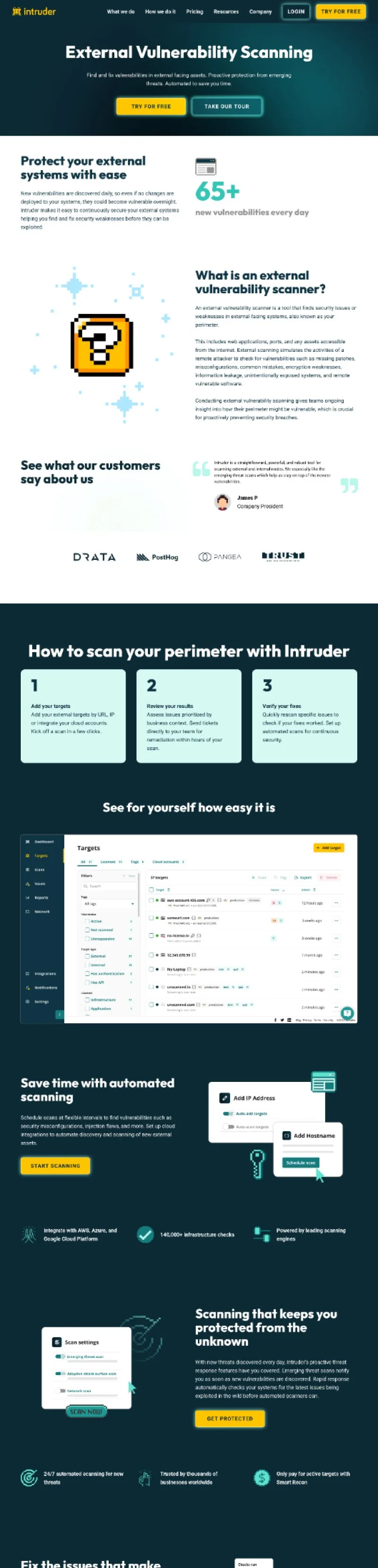
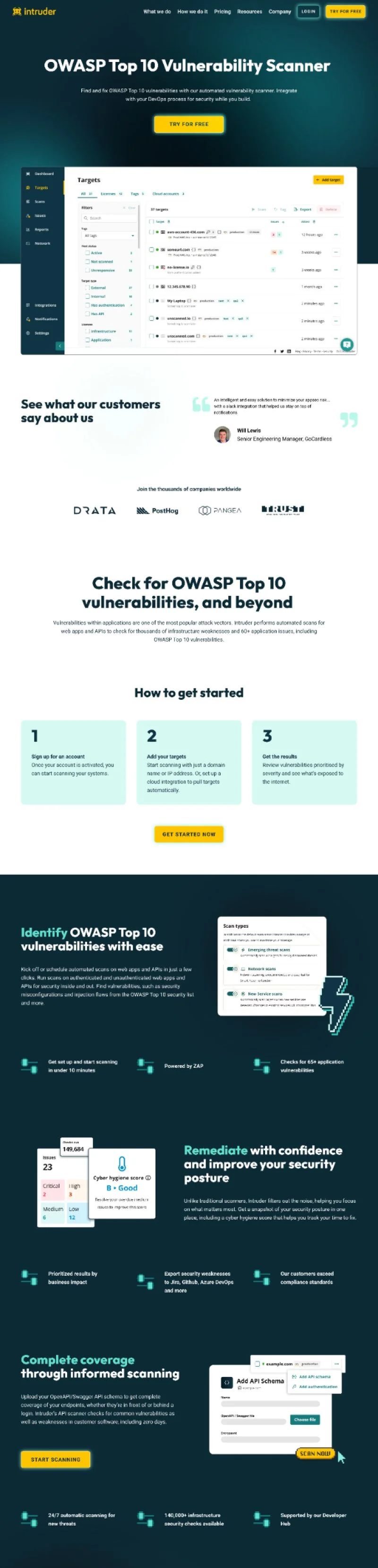
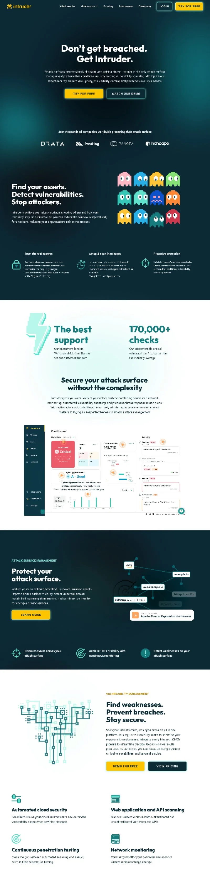
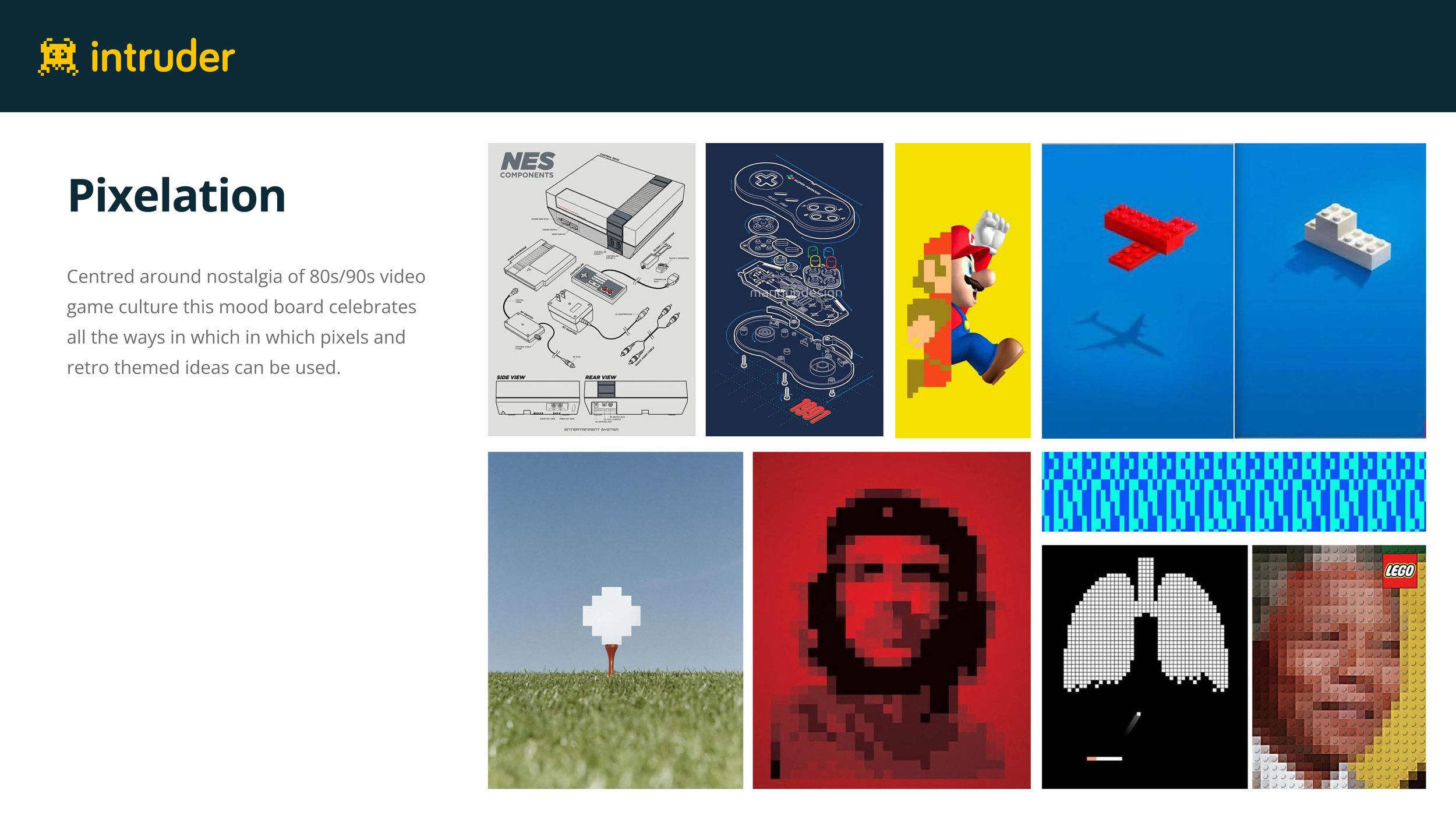
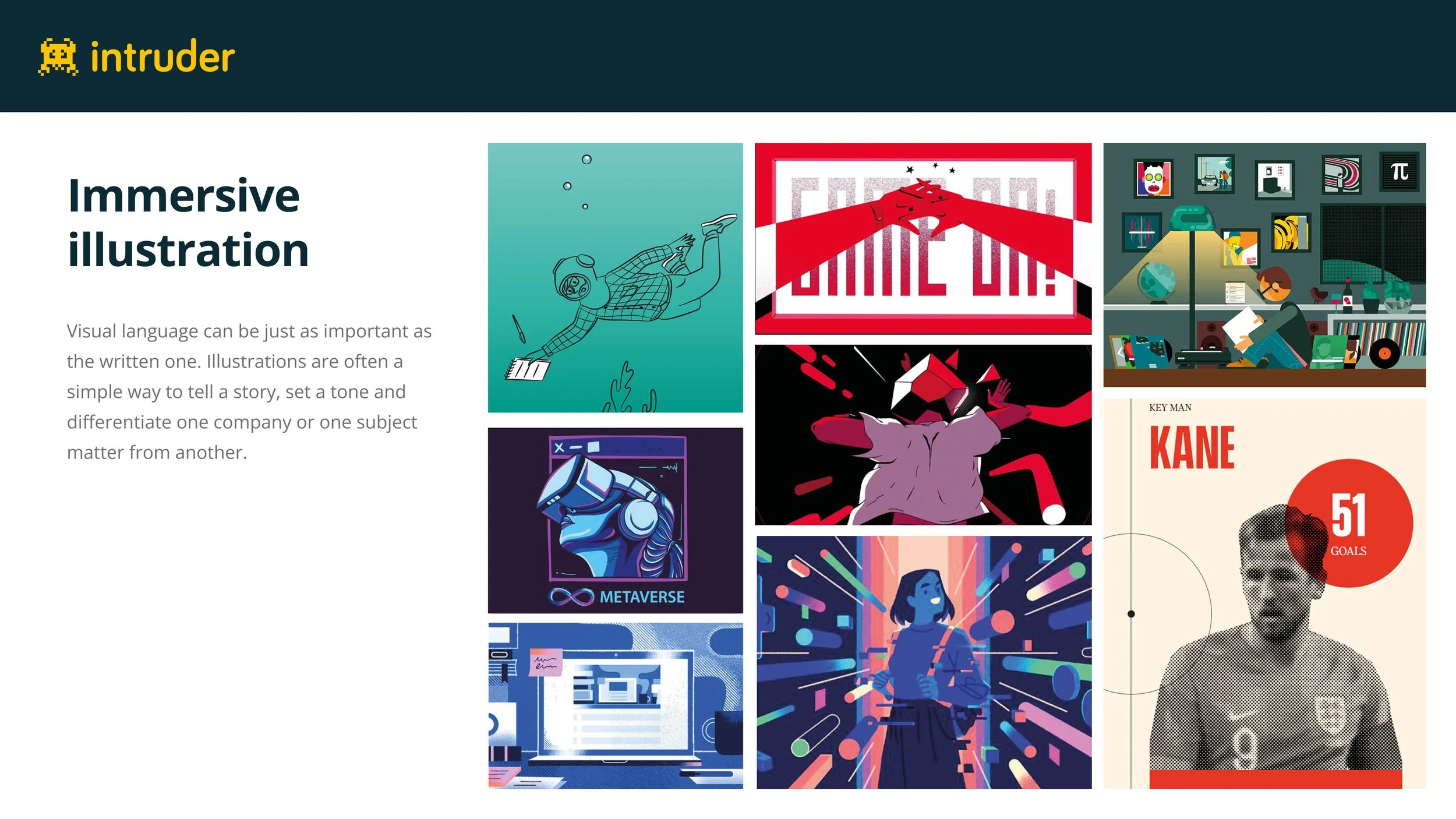
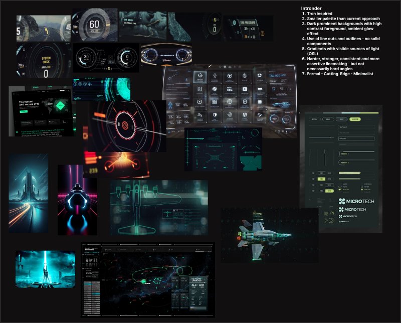
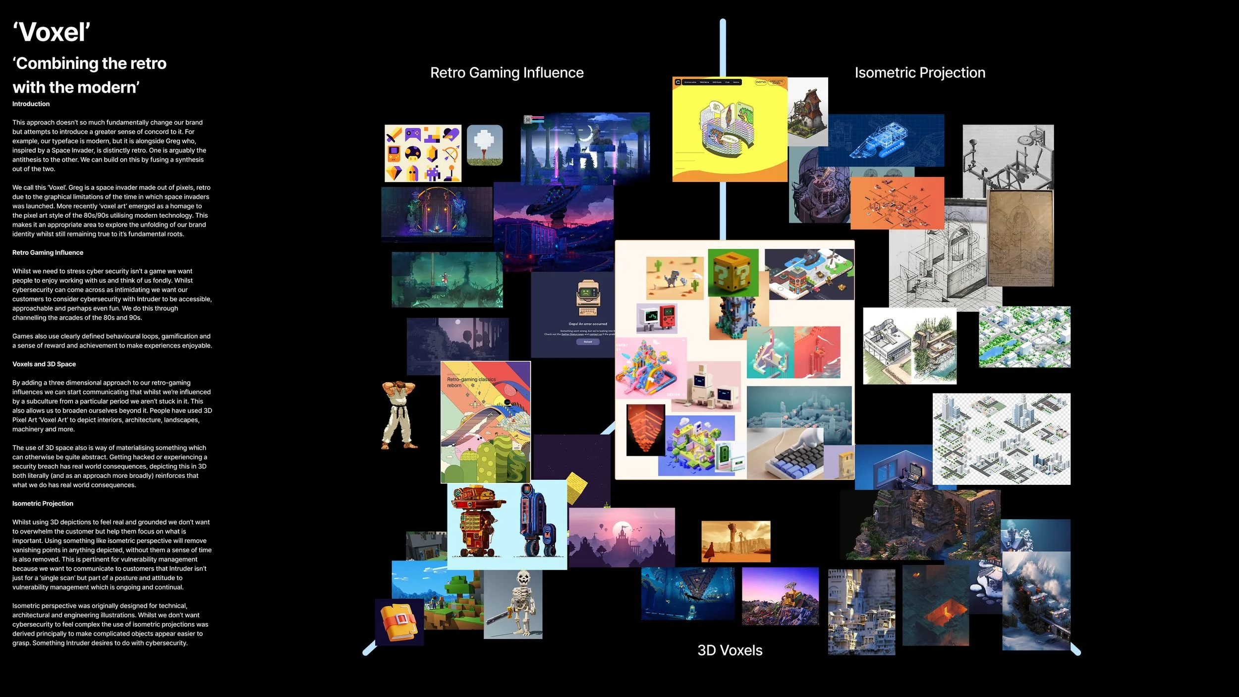
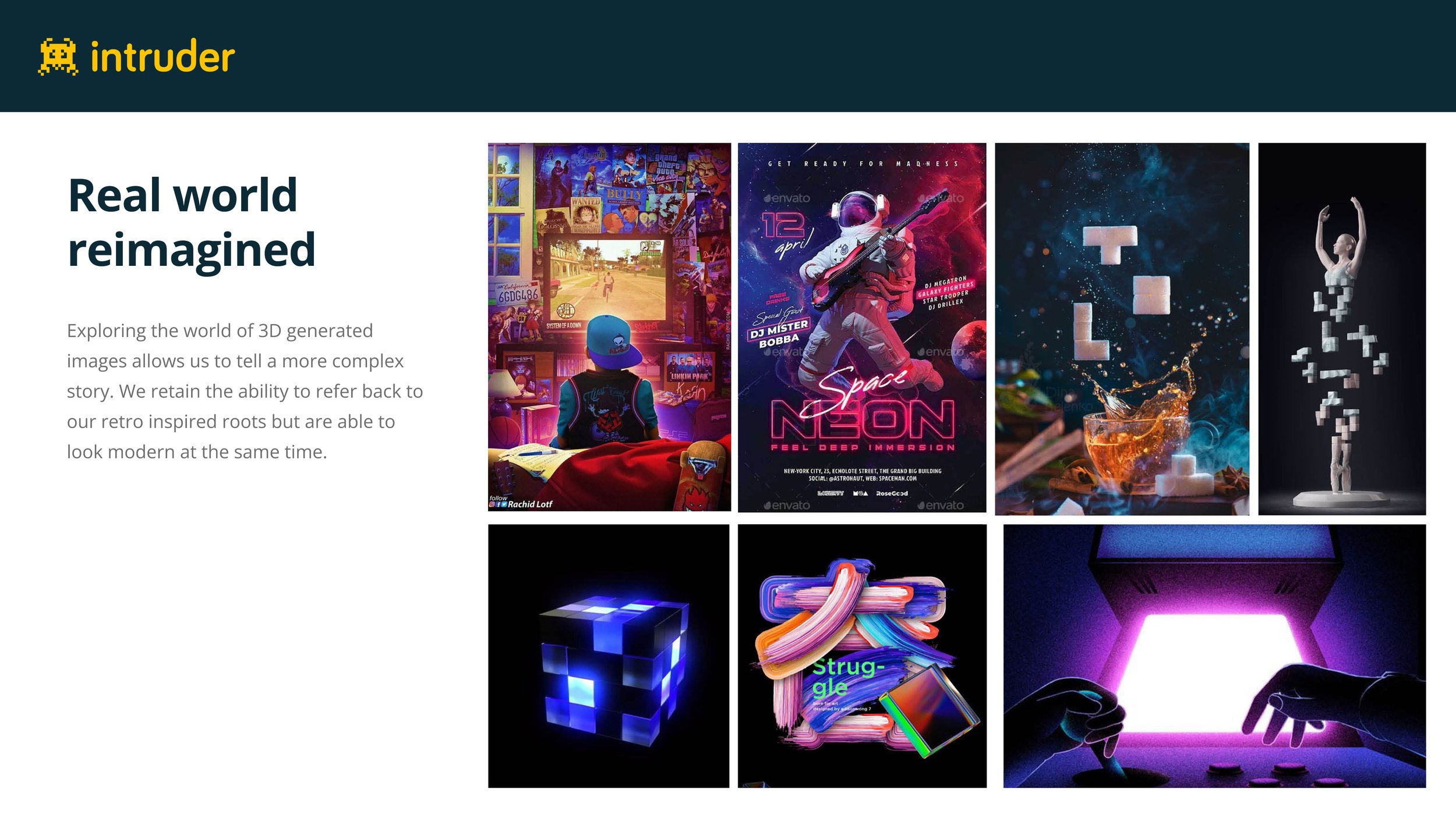
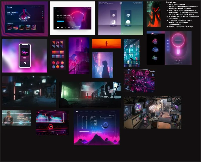
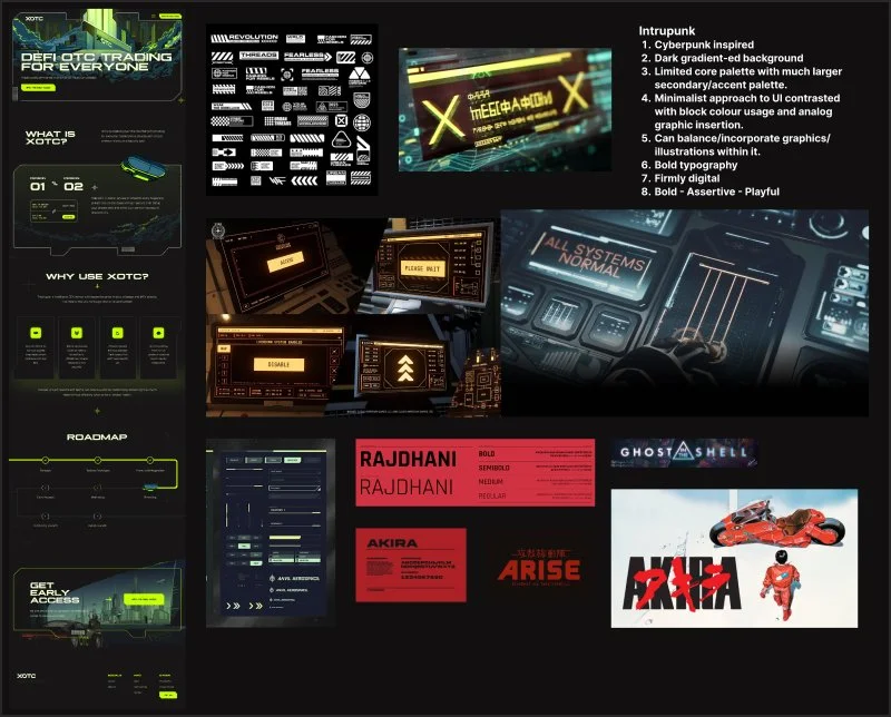
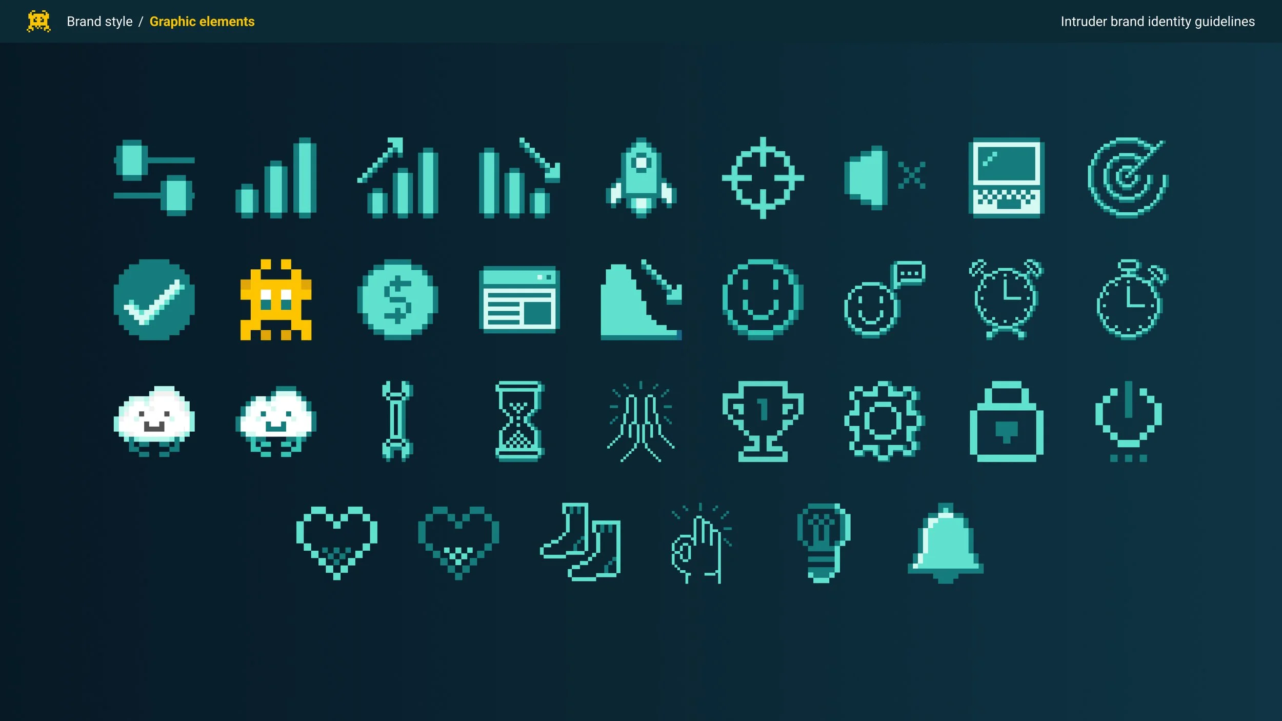
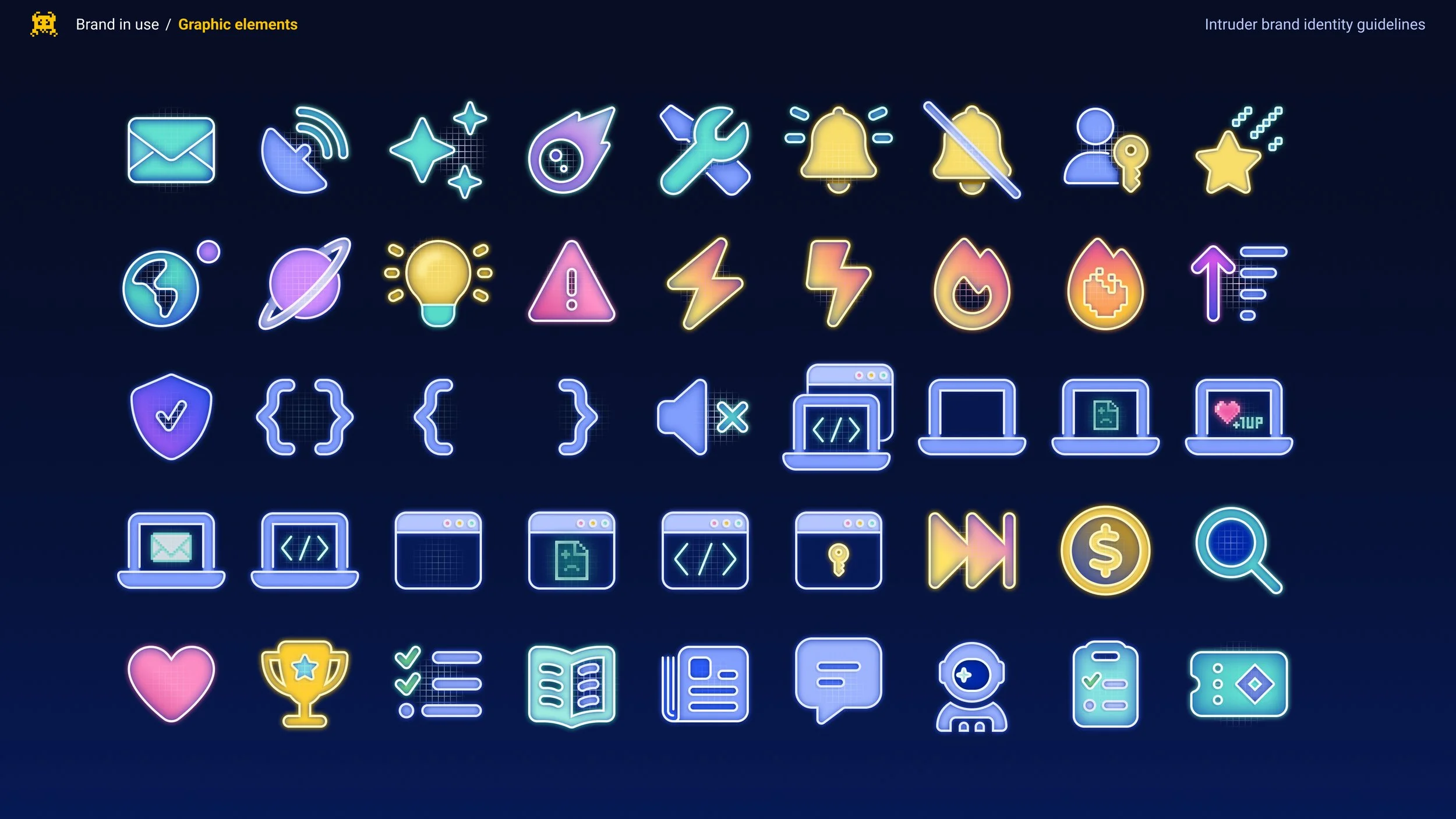
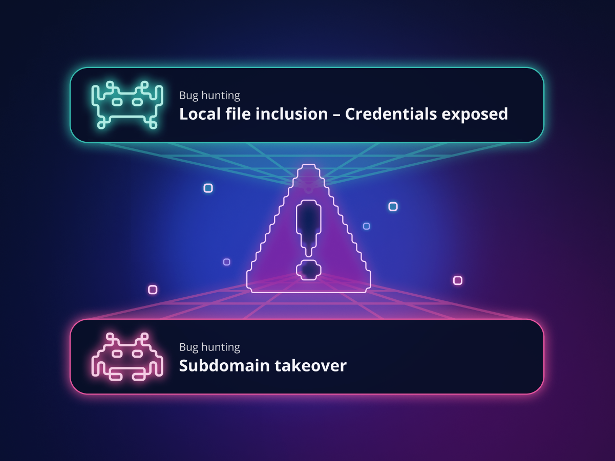
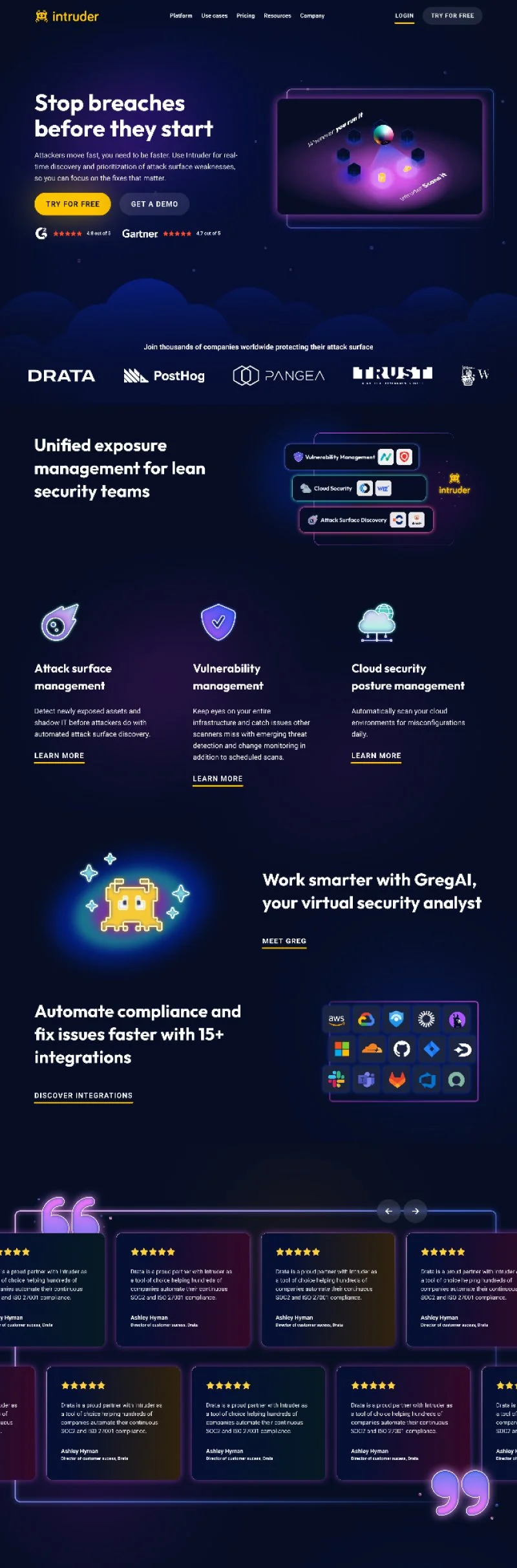
I moved away from the pixel imagery to something more consciously drawing on synthwave and neon aesthetics. These deliberately evoked feelings of nostalgia but were received at the same time as contemporary by both external and internal stakeholders.
To achieve the above, and to work with Intruders yellow accent colour, we made a conscious effort to darken the overall background palette and brighten our foreground elements to create a clearer visual contrast.
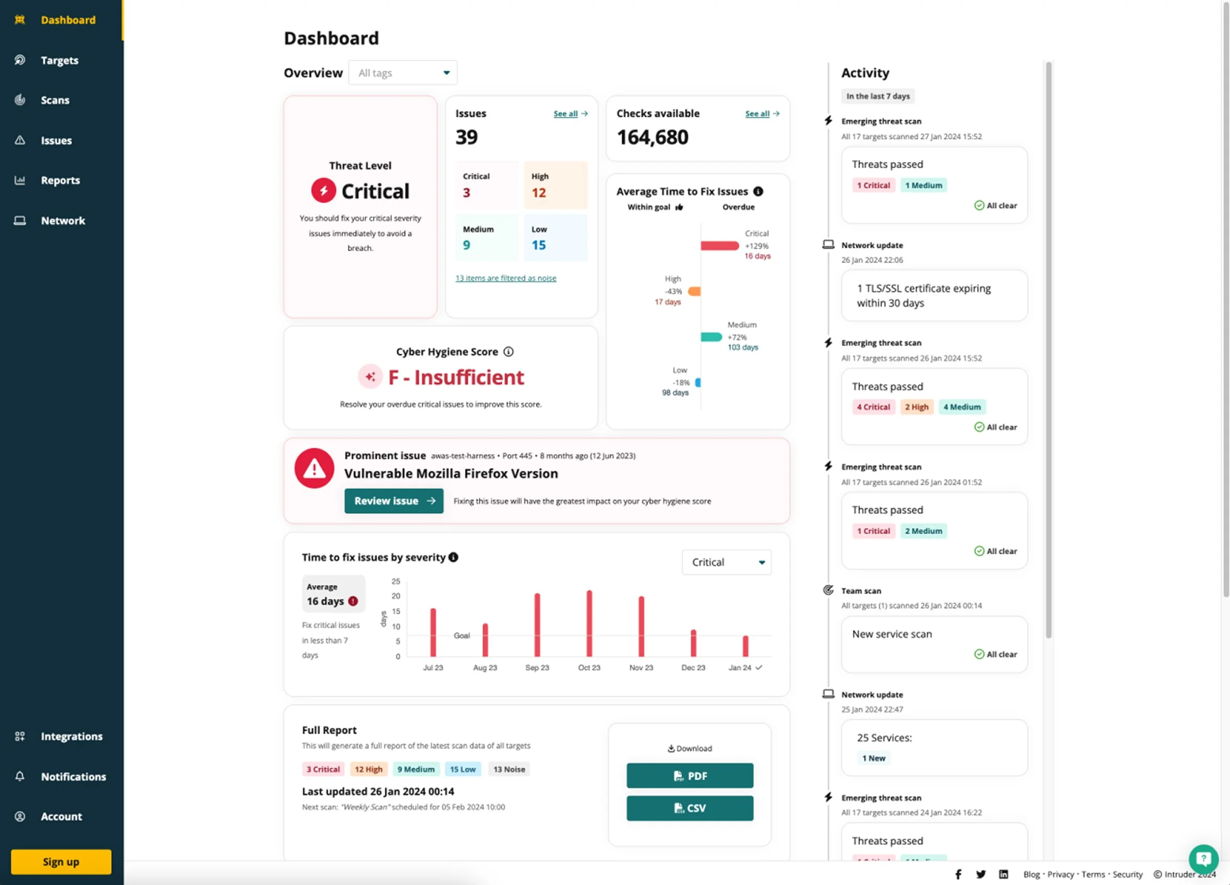
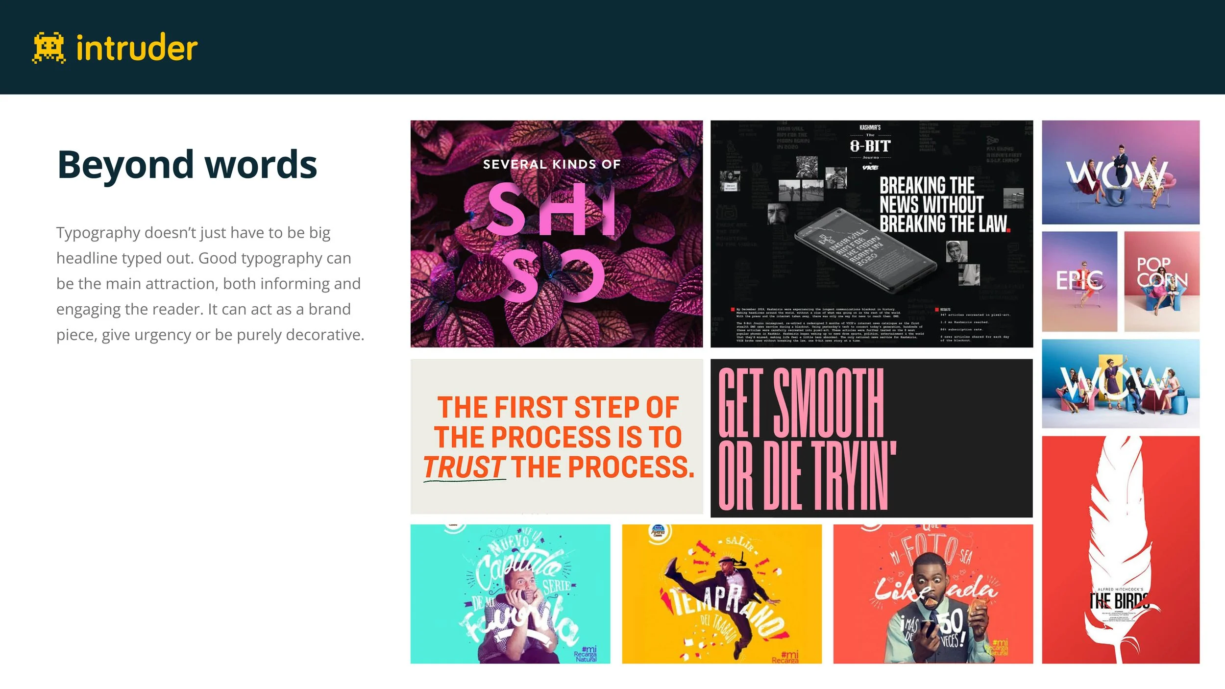
I also consciously made a point to distinguish between the product and our marketing assets. With the latter, I relied less on product imagery and more on messaging, visualisations, and graphics. With the product itself, we consciously tried to formalise it to align more closely with enterprise customer expectations.
Marketing surfaces
The quickest to implement were the marketing assets we focused on these first using advertising campaigns to iterate on the assets and messaging we were coming up with in collaboration with the marketing team.


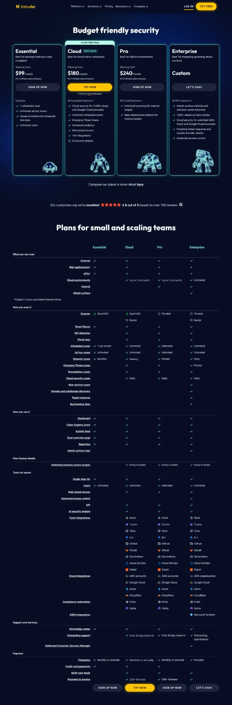
Core Product Updates
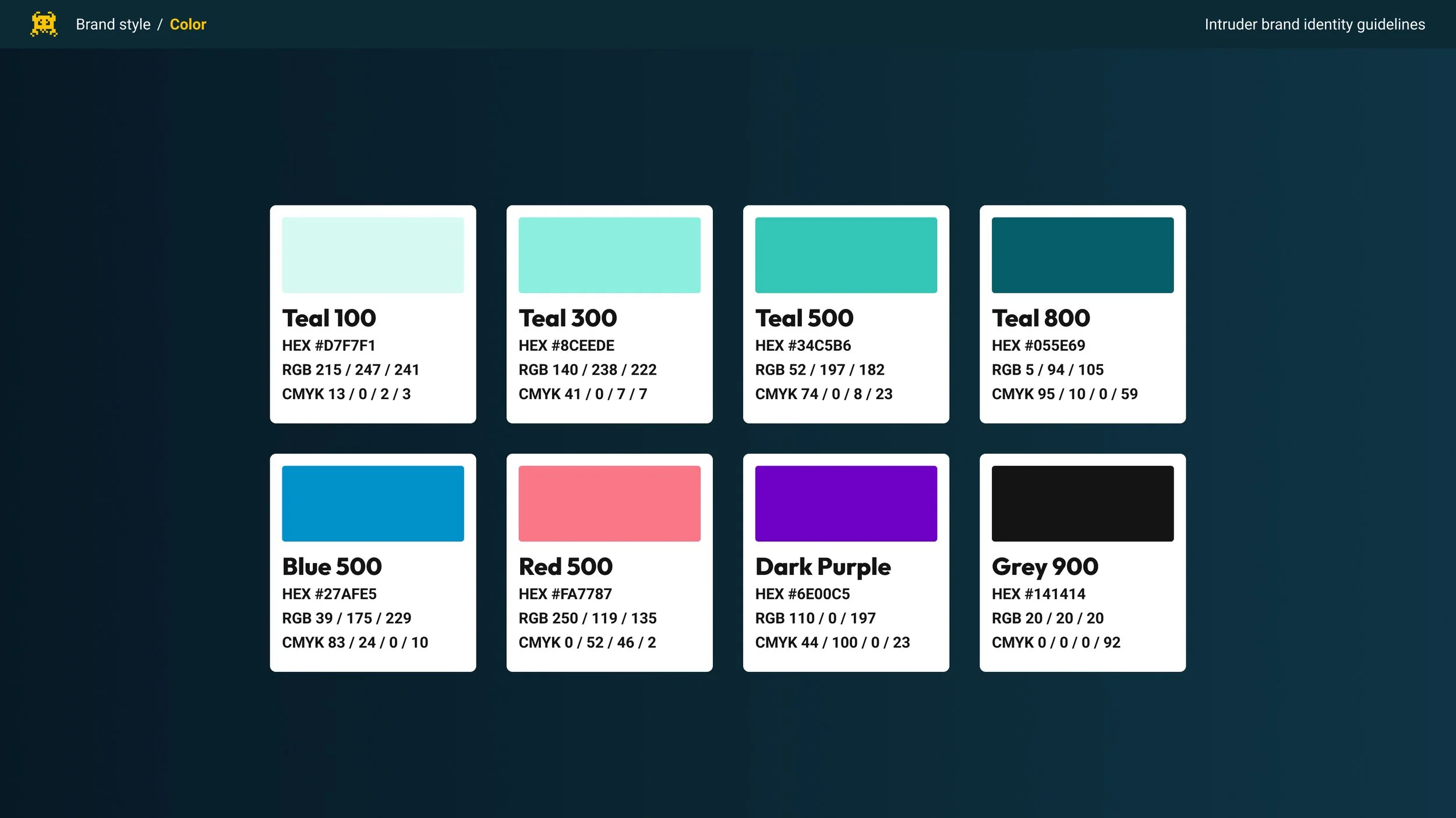
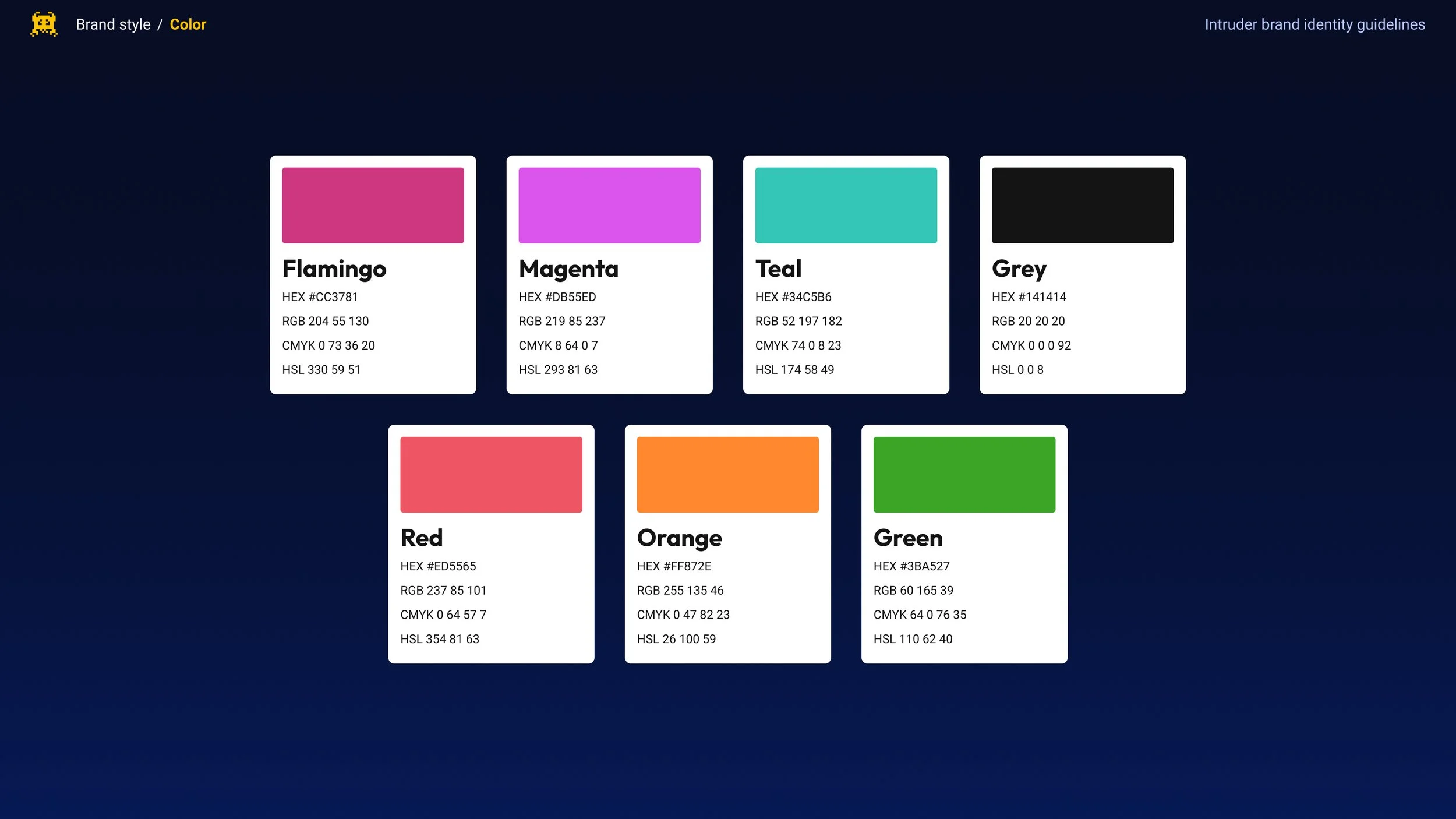
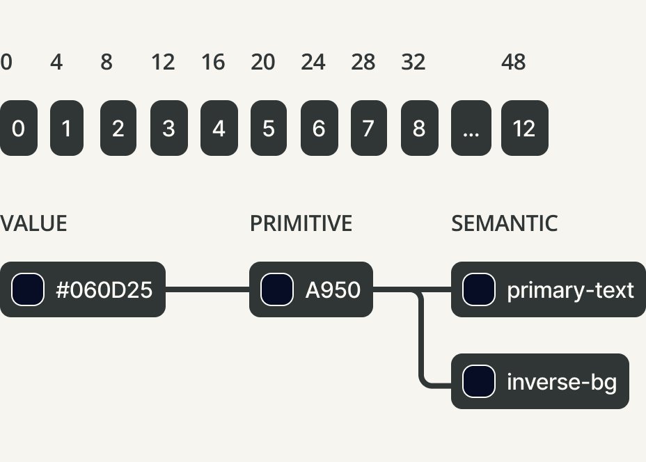
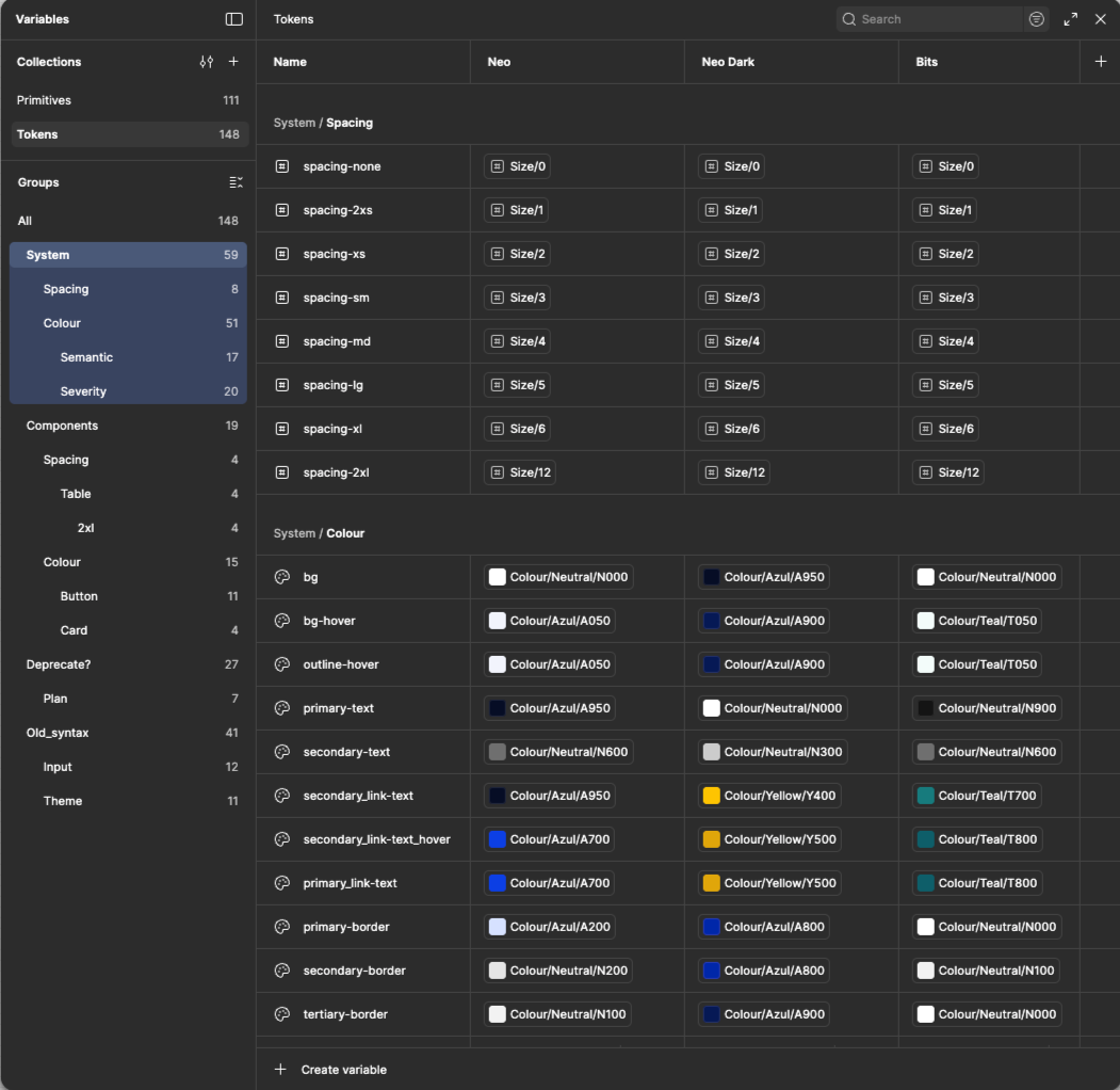
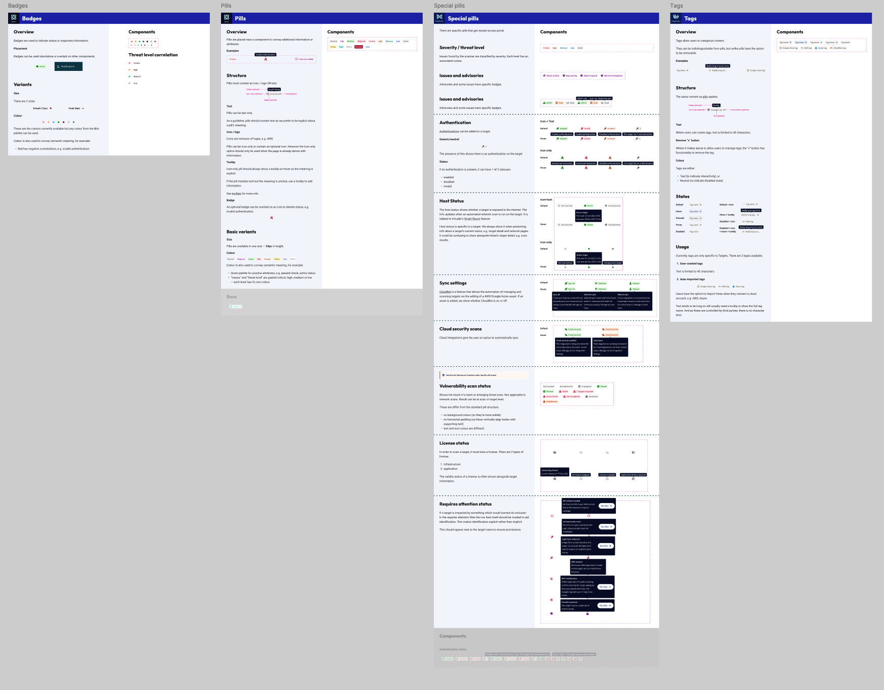
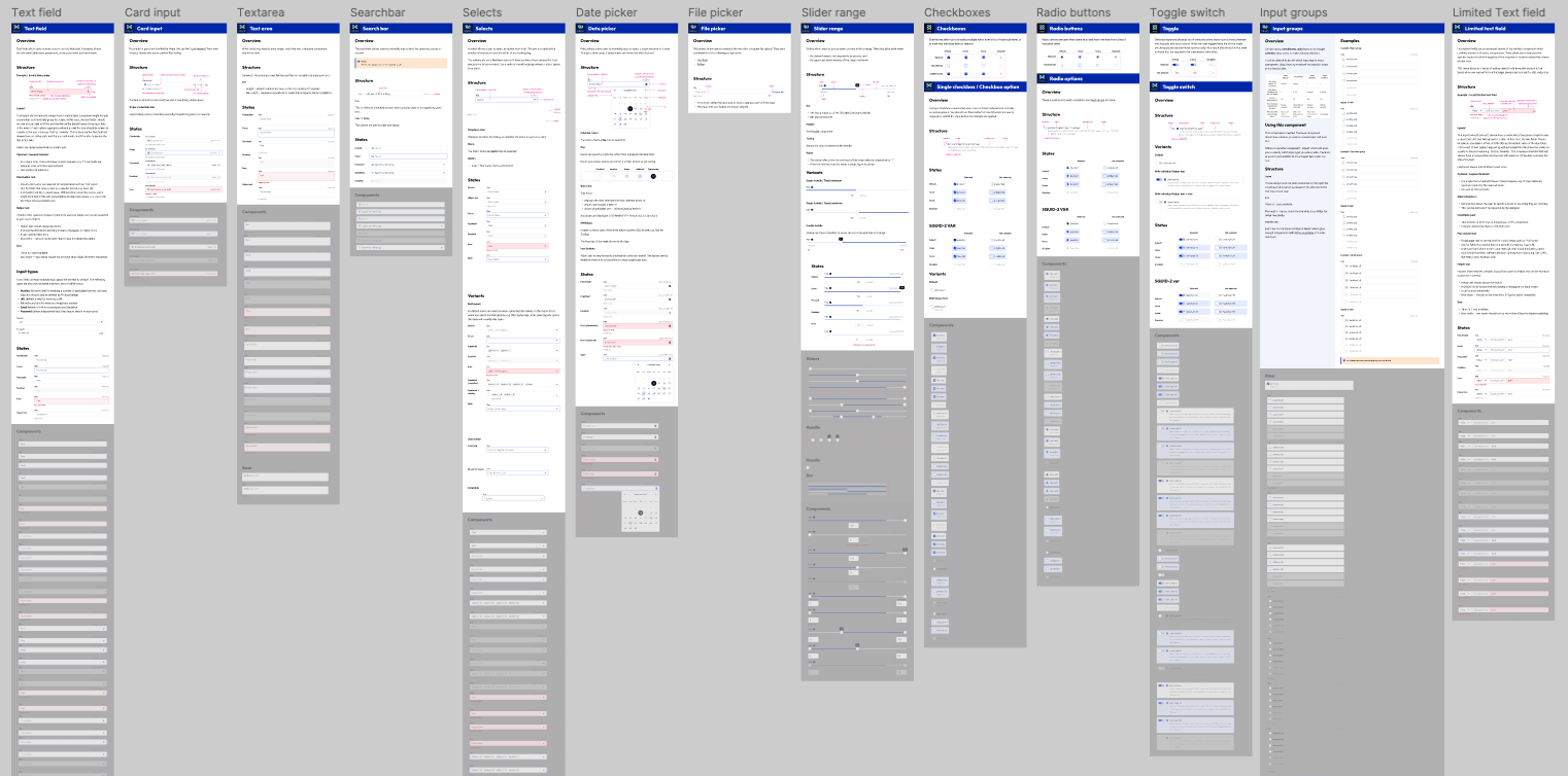
When it came to implementation within Intruder’s core product we published a revised version of Intruder’s Design System ‘Bits’ to facilitate this. This followed a revision of the explicit 12-column grid and a 4px implicit grid we used, including both primitive and semantic tokenisation.
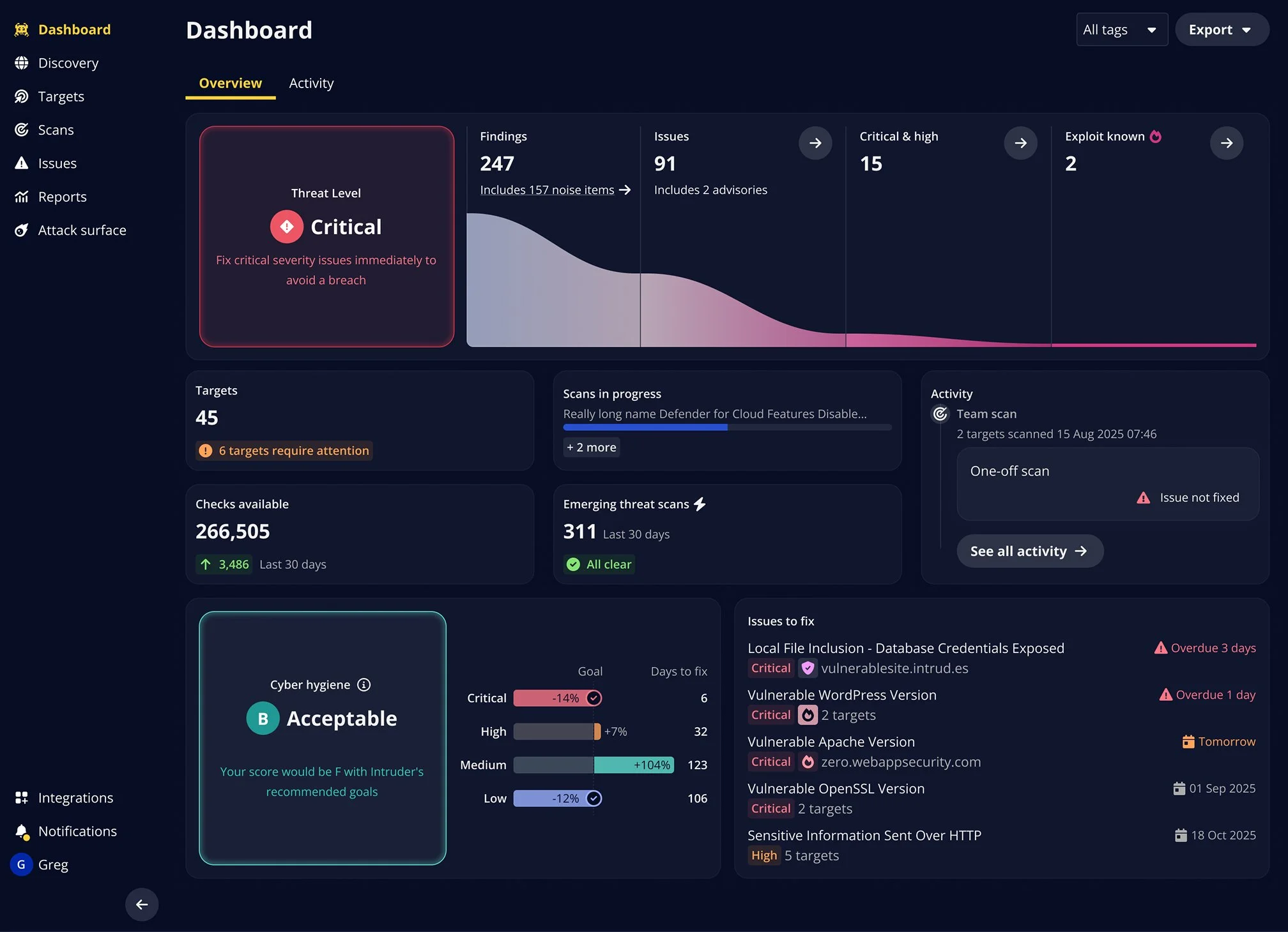
The approach taken with the core product was to actually introduce a divergence between the marketing assets and the core product. We felt that when customers were actually monitoring for vulnerabilities we needed to present an interface that felt much more mature and inline with their expectations and experiences with enterprise scale tools. This ended up being reflected in the design system product as part of the project.
Technical collaboration
As I looked to have this implemented, I worked closely with engineering to:
Understand implementation complexity and technical constraints
Prioritise components that would have an immediate impact, ensuring they are built atomically with naming conventions aligned between the design system and our codebase.
Create documentation that makes handoff seamless
Balance comprehensiveness with adoptability (a simpler system that gets into use quickly beats a perfect one that comes in late or sits unused).
Ensure compatibility with our prior iteration of the Design System, to ensure we are not forcing total rewrites of the code to ensure a prompt delivery.

Constraints and Trade-offs
The project had three major constraints associated with it:
Given team capacity, I made strategic trade-offs:
Deprioritised my IC product work to focus on creative direction and project leadership
Worked with leadership to selectively reduce or rotate the team's product workload during the rebrand
Identified which product projects aligned most closely with annual targets and maintained focus there.
Accepted that overall output would temporarily dip in exchange for long-term leverage
We could not add additional financial overhead to the business as a result of the brand refresh. Everything had to be done in-house. We therefore managed our expectations in terms of the kinds of graphics we could produce as part of this.
My role: I maintained creative vision throughout, directed visual strategy, and owned the design system implementation. One designer contributed significantly to asset creation under my direction, with two others contributing more selectively.
Rollout Strategy
Rather than attempting a big-bang launch, we phased rollout strategically and sequentially:
Budget: The project had no dedicated budget, and any solution we proposed couldn’t cost in any expenses on an ongoing basis. Everything produced had to be in-house. This led to us having to adapt the leading concept in the project to accommodate this.
Bandwidth: Whilst I called upon all of the design team to contribute to the project none of us were on the project full time. This meant I had to plan and rotate team members in and out depending on availability.
Phase 2 (Product Integration):
Design system + Portal tokens
Atomic approach to component revisions throughout the Design System and live Portal in collaboration with engineering.
Deadlines: Updating the public brand touch-points had a hard deadline. Whilst we could take longer to update the product itself we had to work to a reasonably aggressive deadline to meet the goal. This informed the time spent on assets to meet the timeline.
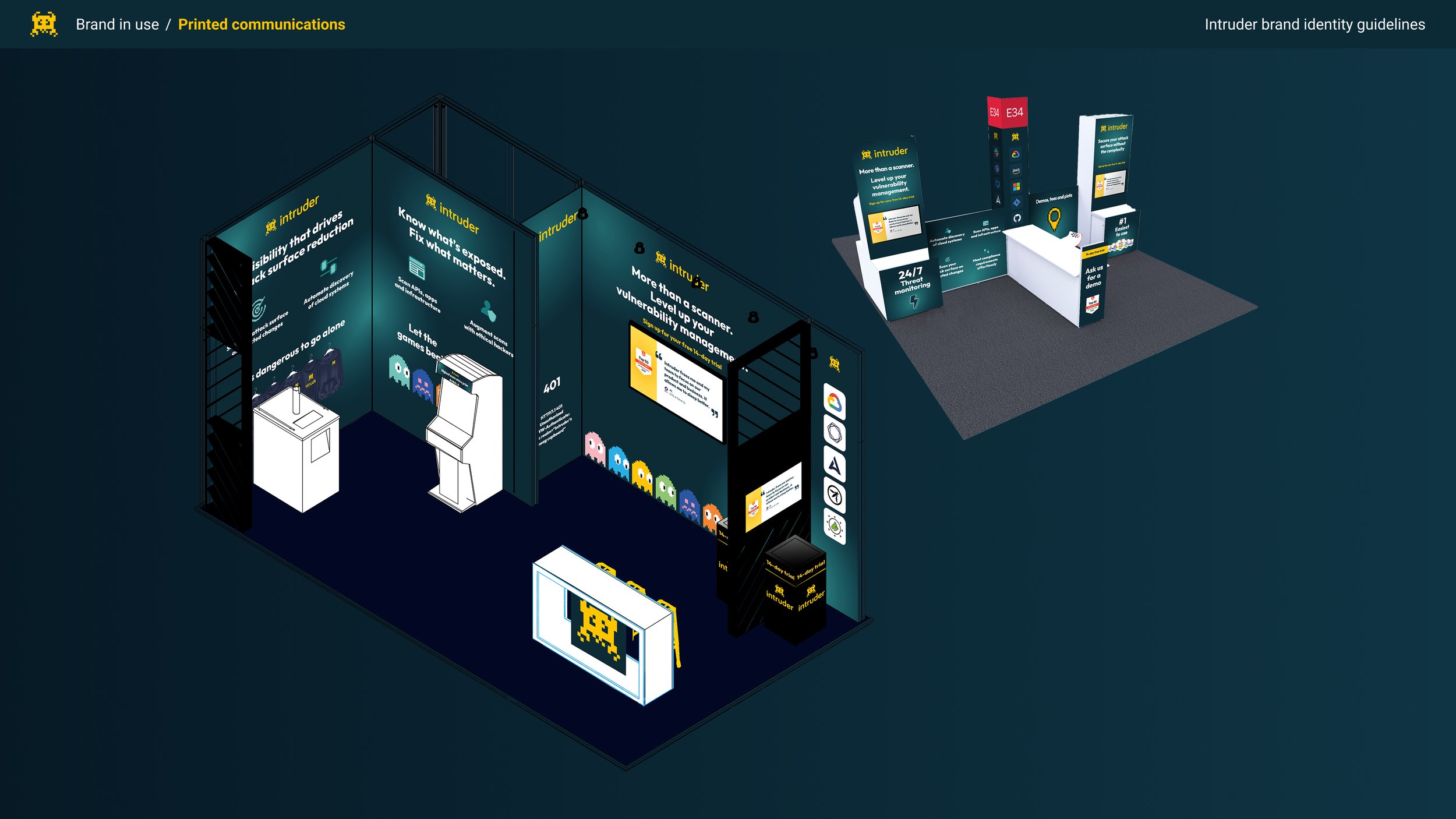
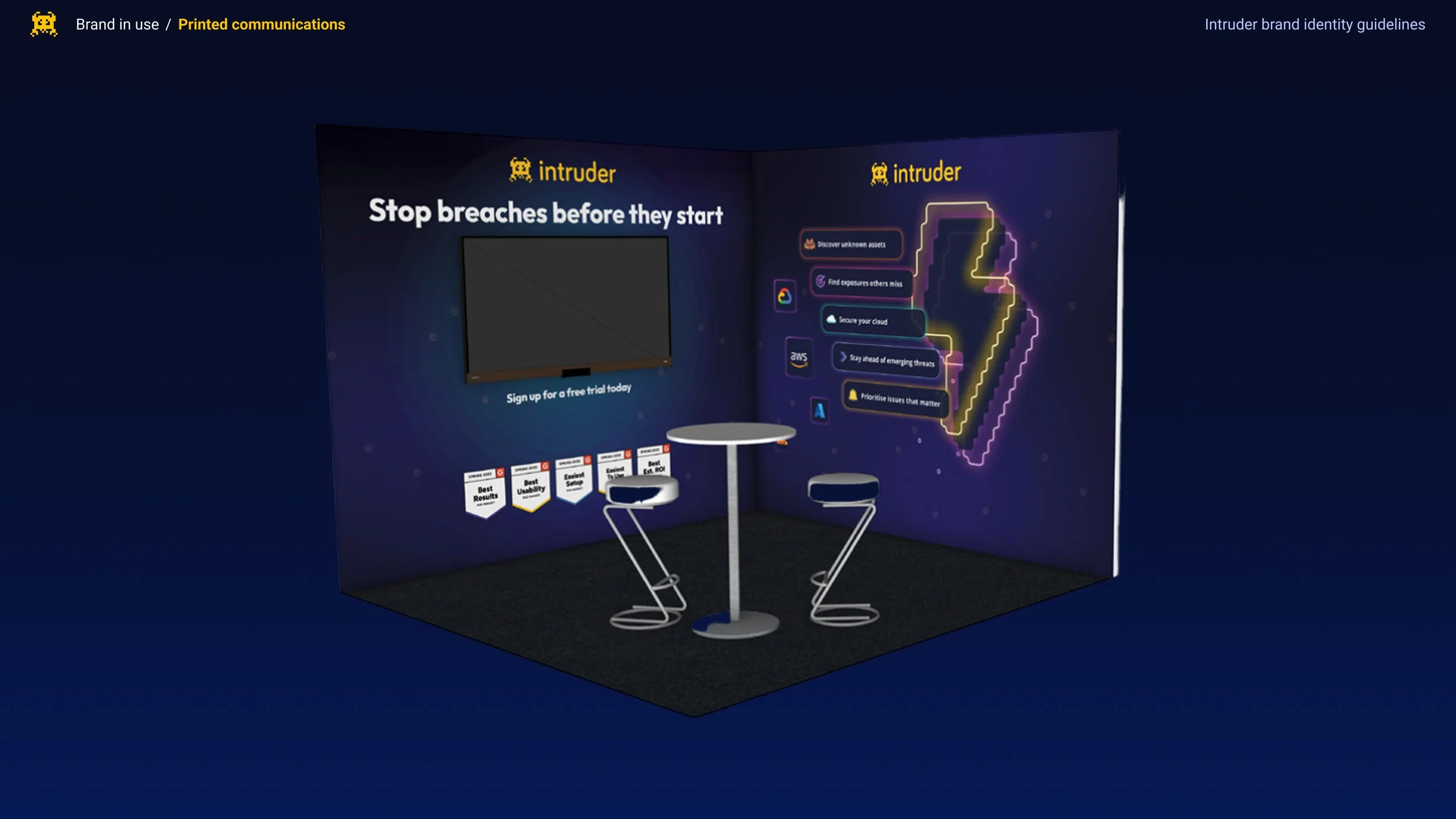
Phase 1 (High Impact):
Conference booth and marketing materials (critical for upcoming trade shows and allowing us to iterate across campaigns nased on performance before committing.)
Marketing website
Sales deck templates
Phase 3 (Long tail):
Report PDFs
Emails
Outcomes
Business Impact
In the year following launch of the revised brand surfaces we saw the following changes:
Enterprise revenue: Grew significantly by 52%, up from 13% the previous year. While we can't attribute this solely to the rebrand, sales reported that the evolved brand removed a key friction point in deals.
Conference presence: The rebrand immediately impacted Intruder’s ability to compete at industry events, pulling significantly more footfall than competitor brands. The CEO reported significant lead generation at events post-launch.
Design-to-development handoff: became more efficient. Reworks and the time to implement decreased dramatically. Tokenisation also enabled work to progress quickly on other requested features like variable themes.
Component reuse: reduced overheads in the team and enabled the team to take on multiple additional dedicated design projects in the following quarters.
Ongoing collaboration: between Design and Front-End engineering emerged. Since then, the two teams have converged significantly and the rate of output has continued to increase throughout the year.
The new design system had a practical effect of making it much quicker to generate designs for not just new features but new brand surfaces.
The new design system and the resultant tokenisation opened a lot of opportunities for variable theming that previously hadn’t been viable.
Internal confidence shift: Leadership's anxiety about moving upmarket transformed into confidence. Intruder was no longer perceived as an underdog but as a legitimate competitor who could earn facetime and demonstrate superiority over larger rivals.
The brand system proved flexible enough for external partners to use effectively. Working with Blublu, I provided guidelines and reviewed work to ensure brand continuity as they created promotional content.
Promotional video created by Blublu, art directed using the brand system. What I loved about this was how they were able to bring back in some of the isometric elements we’d originally explored.
Design System ROI
The design system investment paid off quickly:
Reflections
This was a fast moving project and was an opportunity to work closely with both the CEO and the marketing team at Intruder. Managing a wide range of stakeholders, maintaining a creative vision, whilst also being hands on in the implementation of the project required a lot of context switching, but frequently communication, a clear process, and demonstrating incremental wins proved crucial here.
The very real constraints on the project ultimately bred focus, the limited resources available meant I had to be ruthless when it came to prioritisation. Maintaining team moral and continuity of vision amidst the capacity constraints and pressure from stakeholders also became it’s own informal objective for the project alongside delivering on some ambitious goals.
The lasting impact, for me, were ultimately the systems we put in place. Putting in place a robust design system, or a reusable system of generating graphical assets set up the team to move faster in the time since the project concluded.